Workplace digital signage templates: for Insights
Organise and promote events with clarity and style. Whether it's a team meeting, conference, or special occasion, these templates help you manage schedules, countdowns, and room bookings to keep everyone in the loop.
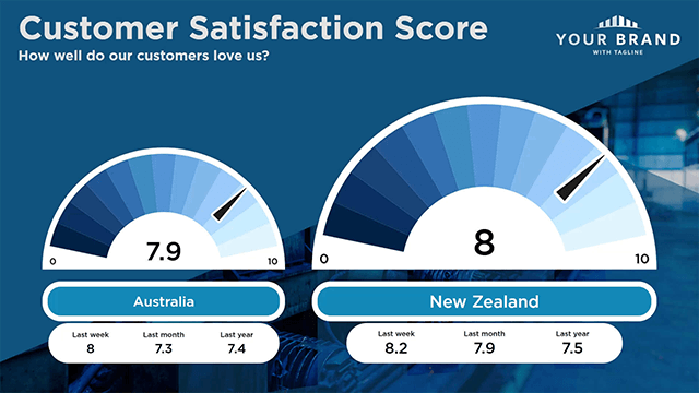
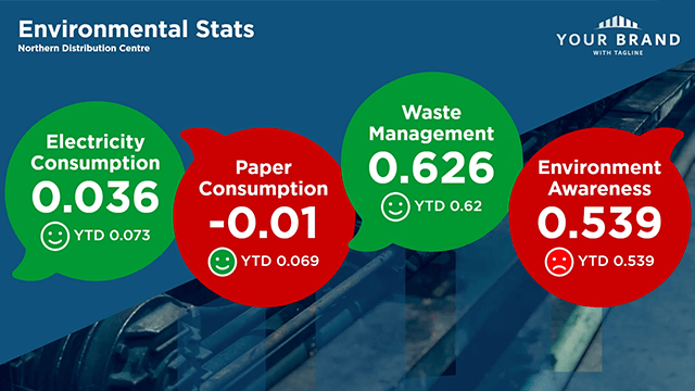
Data, KPIs, Metrics, Dashboards, Goals, Performance, Analytics, Stats, Comparisons, Reports, Charts, Visualisation, Milestones, Dials, Progress, Targets.